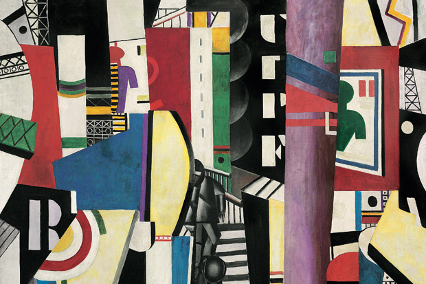
It’s German Season in London, and revealingly the best of three new shows is the one dealing with the most modern period: the post-second world war era of East and West Germany and the potent art that came out of that split nation. In Room 90 is another immaculately presented British Museum show of prints and drawings, focused this time around Georg Baselitz (born 1938). Of the 90 works on display, more than a third has been donated to the BM by Count Christian Duerckheim, the remainder lent by this assiduous collector.
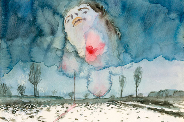
The show begins with Baselitz’s contemporaries and I was surprised to find myself quite liking some things by Gerhard Richter, currently the most overrated artist in the world. Not his traced-from-photos Pop Art drawings but four watercolours, his first in the medium, together with his smudgy graphite drawings of a hotel and pedal-boat riders. A flat cabinet of Sigmar Polke’s drawings comes as light relief and a series of blue watercolours by A.R. Penck is more expressionist and direct than his usual cybernetic stick-figure language. Marcus Lüpertz comes across strongest here, with savage drawings of helmet heads and a richly structured gouache entitled ‘Monument — dithyrambic’ (1976), slightly reminiscent of John Walker. This is art with real bite.
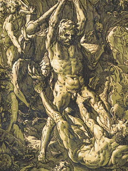
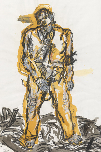
On this showing, the only good thing about Blinky Palermo is his name, but the star of the show is Baselitz, who is given the whole of the second half of this large gallery. Whatever you think of his characteristic upside-down imagery (which he initiated in 1969, conceiving, composing and executing his work thus thereafter), his best work is deeply affecting and often uncomfortable. Baselitz was inspired by Renaissance chiaroscuro woodcuts, which he began to collect and emulate, and various of these — by Urs Graf, Ugo da Carpi and Hendrik Goltzius — are exhibited beside his own efforts. These are certainly worth studying but of greater import are the more abstract images, the eagles and upside-down landscapes from the Sixties and Seventies. A show to savour.
In the RA’s Sackler Wing are more of the chiaroscuro woodcuts that exerted such a powerful influence over Baselitz, including a number from his own collection, augmented by works from the Albertina Museum in Vienna. More than 100 prints are on display in what is a valuable, if rather dry, exhibition. Anyone interested in technique will find it fascinating, but for the non-specialist the variants and repetitions may become tedious. A film of the painter and printmaker Stephen Chambers (born 1960) making a contemporary chiaroscuro woodcut helps to explain the technique in very practical terms, and this is shown in a booth off the first room of the exhibition. Essentially, this revolutionary but short-lived technique of 16th-century colour printing is all about modelling through the interplay of light and dark, with unprinted areas of the paper used for highlights.
The exhibition has been thoughtfully designed with prints in the first and last rooms hung both on the wall and displayed on angled tables beneath, affording easy access for study. Here are woodcuts by Cranach and Hans Baldung Grien, as well as Hans Burgkmair and Hans Wechtlin. I particularly liked Cranach’s ‘St Christopher’ and Dürer’s ‘Rhinoceros’. Famous paintings are reprised, such as Raphael’s ‘Miraculous Draught of Fishes’, done in red by Ugo da Carpi. (The same artist’s ‘Nymphs Bathing’, after Parmigianino, is rather beguiling.) The print is a cheap way of disseminating sculpture as well as paintings: see the Giambologna versions of Andrea Andreani. There is a lot I didn’t respond to, but among my favourites are the two architectural woodcuts by Erasmus Loy, the landscapes by Hendrik Goltzius, and Beccafumi’s ‘Group of Men and Women’, an engraving with woodcut tone.
I’m all in favour of showing familiar paintings in new contexts to enable us to look at them afresh, but the current show in the Sainsbury Wing charges a hefty admission fee for an exhibition of works drawn mostly from the National Gallery’s own collection. Admittedly, it is beefed up by a number of loans from the V&A, the British Museum and other owners, but these are almost entirely works on paper. The public is actually being asked to pay to see works that are usually on display for free. Nevertheless, on the day I visited there was a pretty good attendance at the show. Perhaps this is because the NG is so mobbed by crowds these days, to pay for the privilege is the only way to see pictures in relative peace.
The thinking behind the show questions accepted notions of beauty in historical and contemporary terms, and the patterns of taste that dictated the NG’s own collecting. Much has been made of the reconstruction of the Liesborn altarpiece (c.1470), for instance, yet all we are shown here are the panels the NG owns and some poor photos of the other panels, which are scattered through the world’s museums. Better, if you do decide to visit this show, to trawl for great paintings and not worry about themes or curators’ justifications. There are plenty of wonderful pictures here, from the oddly dramatic Paulus Potter cattle in the first room to everything by Hans Baldung Grien (especially ‘Portrait of a Man’, 1514), the Holbeins, the Altdorfer landscapes, all the Cranachs, and of course the Dürers, but most particularly ‘St Jerome’ (c.1496). There is no catalogue, but the NG has published a handy little paperback (at £9.99), crisply written by Caroline Bugler, on the German Paintings in the National Gallery. But, however much I love and support the NG, the recent habit of charging for exhibitions largely drawn from the permanent collection is undeniably a diabolical liberty.
Meanwhile, Sotheby’s is selling a superb collection of 15 paintings by L.S. Lowry (1887–1976), assembled by A.J. Thompson over a 30-year period and sold now after their owner’s death last year. Subjects include a beautiful small painting of Peel Park in Salford, the trees and areas of grass reminiscent of Mark Gertler’s early landscapes, and two vivid renditions of Piccadilly Circus. There are plenty of hurrying figures and mill buildings (‘After the Fire’ is a particularly fine if bleak example), and the tall chimneys Lowry loved. The sophistication of this supposedly artless painter is everywhere apparent: viewing daily (except Saturday) until the sale on 25 March at 6 p.m.
Got something to add? Join the discussion and comment below.
Get 10 issues for just $10
Subscribe to The Spectator Australia today for the next 10 magazine issues, plus full online access, for just $10.
You might disagree with half of it, but you’ll enjoy reading all of it. Try your first month for free, then just $2 a week for the remainder of your first year.


Comments
Don't miss out
Join the conversation with other Spectator Australia readers. Subscribe to leave a comment.
SUBSCRIBEAlready a subscriber? Log in