When Australia imposed generic packaging in its war on cigarettes, there was consumer research into the most deterrent colour. Pantone 448 was chosen, a sort of sludgy green-brown. When it was described as ‘olive’, Oz’s federation of olive growers formally complained.
Certainly, colours move us. Interior designers know that yellow makes people angry, while in the US Naval Correctional Center in Seattle, what’s known as Baker-Miller Pink (after the officers who created it) has been found to pacify stroppy recidivists. Additionally, as Diana Vreeland averred, pink is the navy blue of India. Racing drivers think green unlucky, even if it is the British national colour in motorsport.
We sometimes see red and that means we are angry, but red is also the colour of love. Clare Quilty in pursuit of the nymphette Lolita in Stanley Kubrick’s film drives an assertive bright red car. Red too was Dustin Hoffman’s Alfa-Romeo in The Graduate, his desperate drive across the Bay Bridge surely one of cinema’s greatest images of romantic yearning.
Our essential understanding of colour is still based on Isaac Newton’s 1671 analysis of light, although artists and writers have, inevitably, made interpretations of their own. Goethe’s Farbenlehre — translated by C.L. Eastlake, the first keeper of the National Gallery — opposed Newton in suggesting that darkness was something tangible rather than a mere absence of light: a poetic intuition, perhaps, of a Black Hole.‘Blue,’ Goethe thought most beautifully, ‘is darkness weakened by light.’
In 1841 artists’ colours first appeared in portable tubes, liberating painters to work outdoors and in this way being better able to observe and capture the effects of nature. Turner was the ultimate observer of natural colour and liked Goethe so much the German is namechecked in several paintings: ‘Light and Colour (Goethe’s Theory) — The Morning After the Deluge — Moses writing the Book of Genesis’ was painted in 1843 and is now in Tate Old Fashioned with surely the most portentous title in the whole history of art.
Kassia St Clair writes with style, energy and knowledge, working through a huge range of material and explaining many mysteries of colour succinctly and wittily: a regular tomato, for example, is not red. Tomatoes appear red because that’s the very wavelength of light their skin does not absorb. A ‘red’ tomato lies to tell the truth. The Secret Lives of Colour is snappily designed and production values are attractively high. It presents its subject as an encyclopaedic Pantone swatch-book annotated with good-natured and diverting anecdotalism.
Chromaphilia is similar in that its chapters are based on colour groups, but the tone is rather different: Stella Paul is an educator at New York’s Metropolitan Museum and her voice is a didactic one. Sometimes it becomes effortfully academic. ‘Newton will be further explored later in the book,’ she writes — and indeed explore Newton we do. While St Clair has no pictures, Paul has a gorgeous and eclectic abundance of them: from the obvious shrieking Munch (who ‘used colour and form to expose internal states’) to the nicely obscure Nardo di Cione.
We are not going to have a new taste; nor are we ever going to have a new colour, even if physicists at Randall Moore University in West Virginia recently claimed to have found one when they shone light through supercold sodium atoms and carbon nanotubes. It was blue. And in the Home Counties, Surrey Nanosystems has achieved the blackest black yet, a ‘superblack’ that reflects only 0.035 per cent of light and sucks photons like Charybdis sucked water. Paint something superblack and it disappears.
Yet colour may not be entirely scientific: Paul says Yves Klein’s famous blue had a ‘velvet finish’, but St Clair sees ‘clarity and lustre’. For my part, I once saw the novelist Anthony Burgess settle down at a concert grand, put a reproduction of ‘The Fighting Temaraire’ on the music stand and play the picture in a camp, but straight-faced, demonstration of synaesthesia. As ever with Burgess, you were not quite sure if he was taking the mick.
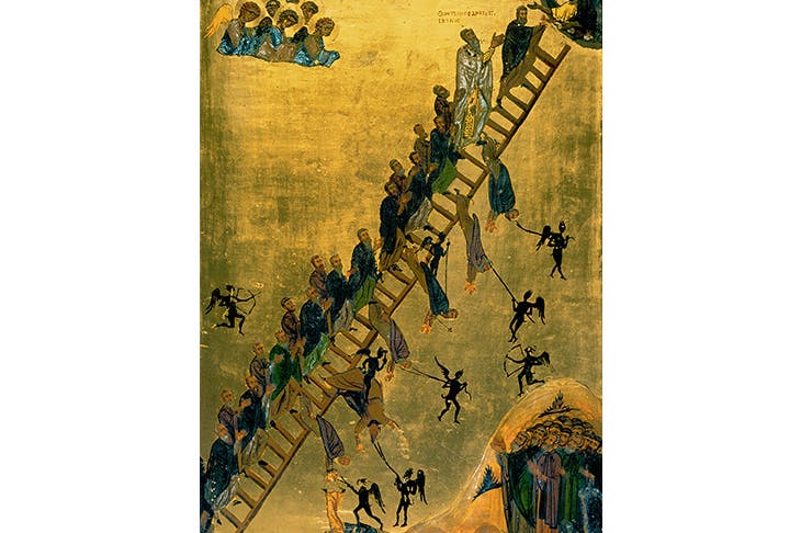
But our enlarging appreciation of colour tracks the growth of civilisation. The ancients had to be content with Tyrian purple, carmine, lapis and black. Gladstone, in a scholarly exercise that shames today’s more narrow and busy politicians, once counted all the references to colour in Homer, finding that black predominated and blue did not seem to exist.
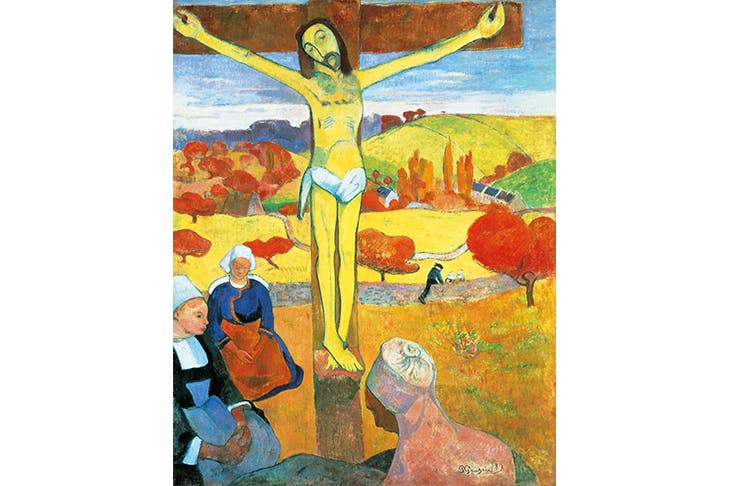
The Yellow Christ’ by Paul Gauguin, 1889
And did the ancients really see the sea as ‘wine-dark’? What colour was their wine? Thanks to Farrow & Ball, our chromatic and emotional spectrum has been widened to include Mouse’s Back, Radicchio, Stiffkey Blue, Dead Salmon and Nancy’s Blushes. Thus are the new emotional possibilities of haut suburbia indicated by tins of paint.
As if in response to a subtle but insistent command, there have been several monographic studies of colour published recently: Michel Pastoureau’s Blue, Spike Bucklow’s Red and Simon Garfield’s Mauve. While these all tend to a microscopic fanaticism, and are none the worse for that, St Clair and Paul are more synoptic and more ambitious, covering the whole spectrum, but authoritatively too. Nicely, each has its chapters’ edges dipped in colours. The competition between these excellent, innovative books is between idiosyncratic cultural history and traditional art history. Each will colour your thinking.
Got something to add? Join the discussion and comment below.
Get 10 issues for just $10
Subscribe to The Spectator Australia today for the next 10 magazine issues, plus full online access, for just $10.
You might disagree with half of it, but you’ll enjoy reading all of it. Try your first month for free, then just $2 a week for the remainder of your first year.


Comments
Don't miss out
Join the conversation with other Spectator Australia readers. Subscribe to leave a comment.
SUBSCRIBEAlready a subscriber? Log in