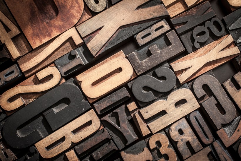
So many headlines over the last year have read more like deadpan satire than actual news that it’s hard to believe we don’t live in an episode of Chris Morris’s still unequalled The Day Today. Take this example last week from The Guardian: ‘Tom Hanks’s son criticized for using “racist” font on merchandise collection.’
As I sat down to interrogate Times New Roman’s imperialist past to ensure my Letter to the Editor wouldn’t be similarly charged, I discovered CNN had run an entire feature on those belittling artefacts of Orientalism, the ‘Chop Suey’ fonts. So now here we are, coming up on two hundred years since The Spectator leant its shoulder to driving through the Great Reform Bill of 1832, discussing the possibility of a Typeface of Evil.
One’s first instinct when confronted with stuff like this is to slam the laptop shut and sink instead into the easy chair with a Stein of Pilsner and a few bound copies of Stormfront to relieve the pressure. However, on closer inspection, it seems there really might be something to it.
Young Hanks – who I think it’s fair to say deserves to be referenced only in his filial relation to The Great Tom rather than by his own forename, or brand, or QI code or whatever kids have these days – has unquestionably kicked a singularly stinky fox into the henhouse of popular discourse here. I have to say, despite my weariness, that yes, it is a racist font. Or at least, one that resonates with obvious racist undertones.
It’s all a question of context. If the font was on the masthead of a staid old county newspaper, no one would notice it. It would be able to enjoy a pint in peace, and privately mourn the passing of The Old Ways without attracting much attention. If it had been used to announce a Sheffield-based heavy metal band some way down the bill at Monsters of Rock, no one would notice either – much to the disappointment of the bass-playing welder who’d suggested they use it to grab a bit of notoriety. Over the door of a Cotswold Toffee Emporium, or a Tattoo Parlour in Reading, or a new, hand-tooled legacy edition of Frankenstein? No problem at all.
But if you proclaim it’s time for a ‘White Boy Summer’ in Old High German Gothic, then yeah, people are going to think you mean troüble.
I realise that, when it comes to giving unwitting offence, I should embody the principle; no exceptions, no doofus left behind. And no doubt when I am dragged away in the middle of the night, a few years hence, my preference for Blue Black Quink having become suddenly more problematic (for reasons I can now only guess at now but that will probably be something to do with colonialism), I will have cause to look back on this abject shrug of mine, with some bitterness.
But still. It is pretty obvious, isn’t it? If you want your celebration of ‘white boys’ to slip into the main stream of celebrity endorsement like a swan, rather than an excited spaniel, then don’t use a script principally associated with the Third Reich.
Some typefaces are more subtly problematic, I admit. I’d forgive anyone blithely using Gill Sans to contact their local women’s refuge, or indeed dog shelter. And while posting a notice in the office canteen in Comic Sans is one of the few offences that demands instant dismissal without appeal, that is largely an aesthetic crime, like wearing a cycling helmet indoors.
But it is unavoidable, sadly, that the great Teutonic scripts, glorious though they are in their rightful place, have to be handled with care.
What is most depressing, though, is not that Hanks jnr. caused a Nazi-adjacent frisson with this typography, or indeed the alacrity (how much did his schooling cost?) with which he distanced himself from that little thrill, once it had been brought to his attention.
It’s what this news story tells us about the State of the Discourse. Which is of course that it’s all about Race. It’s hard to avoid the sinking realisation that the potential for causing and taking offence through language seems to grow by the day. Typography is indeed a great, nuanced and fascinating subject. It can work with the text or undermine it, just as voice can enhance or diminish a speech. But as with so many aspects of today’s culture, it’s only when it’s suspected of being racist that it can fire up our jaded synaptic palates, and make us click, and like, and share.
And in that regard, it must be making the guys who gave Old High German Gothic script a bad name in the first place, immensely proud.
Got something to add? Join the discussion and comment below.
Get 10 issues for just $10
Subscribe to The Spectator Australia today for the next 10 magazine issues, plus full online access, for just $10.


Comments
Don't miss out
Join the conversation with other Spectator Australia readers. Subscribe to leave a comment.
SUBSCRIBEAlready a subscriber? Log in