The Watts Gallery, just outside Guildford off the Hog’s Back, is a delightful place to visit at any season, with its permanent collection of work by G.F. Watts, whose studio it once was, and an ambitious programme of exhibitions on related subjects. But as autumn reaches over the hills a sense of the Victorian past may be even more closely felt and appreciated, and particularly a life of promise cut short, as was the case with Frank Holl (1845–88). Until this exhibition began to gather a fresh audience, few had heard of Holl or were able to summon an image by him to mind. This show brings together some 30 of his most famous works and offers us the chance to reassess an unfairly forgotten talent.
Holl came from a family of engravers, and himself worked on The Graphic, a newly founded illustrated weekly newspaper. Among the contributors were Trollope and Thomas Hardy, as well as artists Frank Brangwyn and Luke Fildes. When he lived in England, Vincent van Gogh deeply admired Holl’s prints, which he saw in The Graphic, writing to his brother: ‘For me one of the highest and noblest expressions of art is always that of the English, for instance Millais and Herkomer and Frank Holl. What I mean in regard to the difference between the old masters and the modern ones is — perhaps the modern ones are deeper thinkers.’ It was Holl’s early subject pictures that van Gogh responded to: the social-realist work which can seem a trifle sentimental to modern eyes.
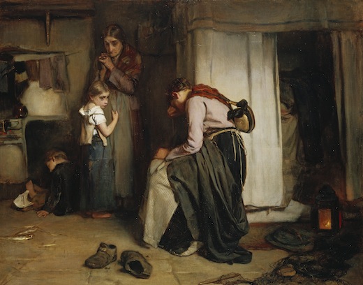
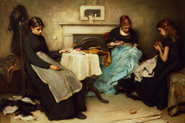
Look at ‘Faces in the Fire’ with its blatant symbolism of poverty: broken saucer, bare feet, empty birdcage. Other paintings resonate with such titles as ‘Hush!’ (the baby sleeps) and ‘Hushed’ (the baby is dead), or ‘Despair’ and ‘Hope’. To my mind, the narratives are of less interest than the still-life episodes within the compositions — beautifully painted flowers or crockery on a table, a workbox on the floor. One of the most affecting pictures is entitled ‘Gone’ (c.1877), which in its looser handling, vivid paintwork and pleasing spontaneity suggests the sketch rather than the finished composition. At the far end of the gallery is a group of portraits of the rich and famous, which became Holl’s staple output in the 1880s. The most interesting are of John Tenniel, Lewis Carroll’s illustrator, Gladstone and W.S. Gilbert of Gilbert & Sullivan fame.
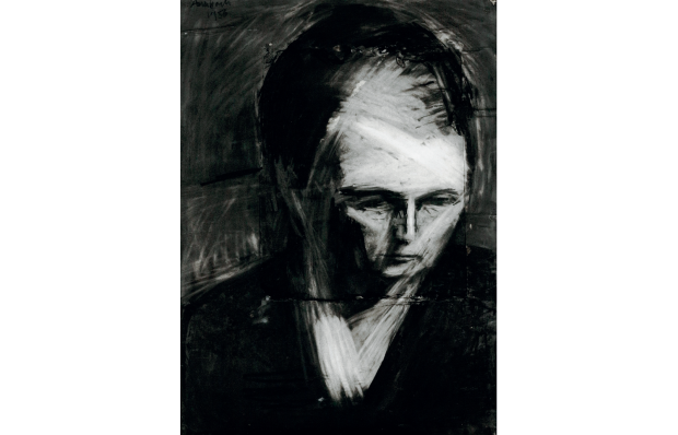
A rather good early self-portrait betrays a handsome but tense appearance: Holl already looks to suffer from anxiety, which would kill him. In effect, he worked himself to death (very Victorian), exhausted by portraits, unable to decline a commission (the self-employed will know this fear), partly because he persistently lived beyond his means. For reasons social, historical and artistic, Holl is worth looking at again. If you miss it in Guildford, this timely show will travel to the Mercer Art Gallery in Harrogate (23 November to 30 March 2014).
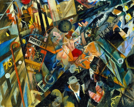
George Grosz (1893–1959) was one of the greatest satirists of the 20th century, with a fiendishly savage wit guiding an ink line of trenchant economy and apt distortion. A Berliner, he recorded the city’s corruption with merciless clarity: excoriating the greed, decadence and stupidity he saw all around him. As Frank Whitford observes in the sumptuous hardback catalogue (£50), Grosz loved to shock and was ‘morbidly fascinated by the lewd, seedy, malevolent and ugly’. And that’s what we are regaled with in this exhibition of 50 top-quality drawings and watercolours, from Grosz’s best period, all dating from 1912 to 1928. The very first work, ‘Travelling Circus’, is almost traditionally solid and classical in approach, and surprisingly tenderly done, though the barker hawking his wares (including two sexually available women) is not much different from the later gross consumers. Already the theme is display and availability, the commodification of the flesh, appetites and their slaking. In these early drawings the ink line diversifies into an unexpectedly delicate tracery, later to be honed down and sharpened, though not to a single line, more a series of broken, stabbing hatches.
 George Grosz, Tempo der Strasse (The Tempo of the Street), 1918. Courtesy of Richard Nagy Ltd, London
This potent graphic thrust gets spikier and more devastating as you move around what is a rather densely hung exhibition. It’s interesting to see how Grosz combines watercolour with his ink, adding in colour to soften and ameliorate his images, cleverly modelling flesh and fabric. But essentially these remain tinted drawings, the colour used to make the biting satire more decorative and acceptable. Was he just sweetening the pill? Or was he further pointing to the contrast (and emphasising the horror) between the dark deed and its more colourful garb? Perhaps a little of each. The colour and drawing in ‘Night Scene, Berlin’ (1915) seem to recall the altogether happier imagery of Chagall, but soon the death’s heads lurk in the cafés and the degradation proliferates. I respect this period of early Grosz (before he went to America, sold out and grew soft), but although I can admire the quality of the work, I cannot enjoy it. This is not what I’d call a life-enhancing exhibition, though it is decidedly bracing.
One floor down is a much calmer, more contemplative and eminently more beautiful exhibition at Thomas Williams gallery. It comprises some 30 works on paper by that unsung master of modern American painting, Mark Tobey (1890–1976). Mostly gentle abstract mark-making in tempera, they have a rare and limpid presence, at once pragmatic and elemental. Forms coalesce and swarm, divide, circle round and repeat, adumbrating rhythms of great subtlety and seduction. Tobey is best known for his ‘white writing’, of which there is one magnificent example here, a web of white lines on a darker ground simultaneously evoking form and dissolving it in light. Tobey also used a much wider range of colour and experimented with texture (see the lovely raised surface of ‘Phantoms of the Memory’, 1960), his trademark doodling looping line alternating with brushy dabs and smudgy or clean-edged taches.
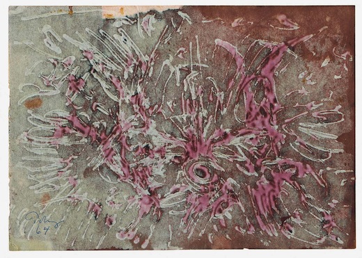
The interweaving patterns are utterly beguiling and despite their superficial resemblance to Oriental calligraphy have a more profound philosophical import in their layering of statement and obliteration. These images are all about being and non-being, trace and disappearance, even when they most look like the mating dance of a phoenix in the snow. Tobey is a crucial figure for Abstract Expressionism (compare his approach to Jackson Pollock’s drip method) and yet is almost unknown in this country, and barely celebrated in America. The last major exhibition of his work here was in 1962 at the Whitechapel Gallery under the enlightened directorship of Bryan Robertson. For an artist of Tobey’s stature and achievement the works are still remarkably modestly priced. Not to be missed.
Got something to add? Join the discussion and comment below.
Get 10 issues for just $10
Subscribe to The Spectator Australia today for the next 10 magazine issues, plus full online access, for just $10.
You might disagree with half of it, but you’ll enjoy reading all of it. Try your first month for free, then just $2 a week for the remainder of your first year.


Comments
Don't miss out
Join the conversation with other Spectator Australia readers. Subscribe to leave a comment.
SUBSCRIBEAlready a subscriber? Log in