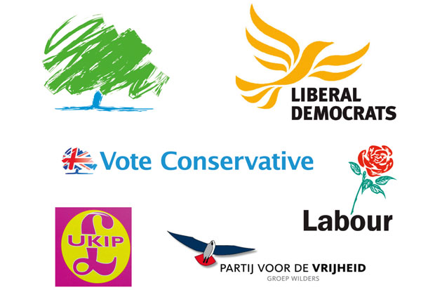
Now that the conference season is over, we can compare not just the party policies, but their logos too. Last week’s Tory conference taught us the patriotic adaptation of their tree — now draped in the Union Flag — doesn’t work any better than the original green-tree symbol. The old symbol demonstrated Conservative values as imagined by the Innocent smoothie design team. It said ‘Tradition’. It said ‘the Environment’. It said, ‘Look what I can do with my crayons, Mummy.’
Stephen Bayley, design expert and Spectator colleague, was one of the hapless advisers tasked with picking the old logo. ‘Not so great,’ he told me, ‘but you should have seen the alternatives.’ The Union Flag tree was in part the brainchild of Andy Coulson, who felt the British flag should be involved somehow. But it looks like a sop to the disillusioned Tory right, meeting the improbable brief of being both patronising and scary.
Never underestimate the power of a strong institutional image, as one old ad slogan went. From the cross to the swastika (itself a conscious denial of the former when nicked by the Nazis), good logos are loaded with significance. At best, they should be shorthand for complex ideas — daubing a hammer and sickle on to the wall of your local McDonald’s is quicker, more effective and a damn sight less boring than copying out the entirety of Das Kapital.
You wouldn’t see this with the Tory logo, old or new. Nor would you get it from Labour. The red is a start — but the rose? You’d think they were a socialist dating agency. The most interesting thing you could say of the Lib Dems’ ‘Bird of Freedom’ is that it has an unfortunate similarity to the logo of Holland’s hard-right Party for Freedom. The latter, as the broadcaster Jonathan Meades told me, was adopted when the party began gunning for popular support, ‘disassociating itself from the pan-European far right to suggest it is just as wet as the Lib Dems’.
Ukip’s symbol is quite successful by comparison. It communicates the spirit of gung-ho crapness the party uses to sell itself as an antidote to Westminster slickness. It’s hilariously amateurish. The colours make it look like an angry pimple, while the design is Poundstretcher by way of clipart. You get the point, though. They know what country they live in and they won’t be targeting the aesthete vote any time soon.
It’s just easier for a fringe party to get the message across, and easier still for an extremist one. But why is the political mainstream’s design quite so rotten? Bayley has a theory: ‘Very little, in my opinion, that is worthwhile arises from consensus or committee. Since democratic politicians depend on market research and groupthink, the circumstances to do decent creative work on their behalf don’t exist.’ If you’re trying to please everyone, you lose the essential single-mindedness needed for a decent logo. It’s the art director’s answer to that old joke about train times: say what you like about Hitler, but at least he gave a clear design brief.
Got something to add? Join the discussion and comment below.
Get 10 issues for just $10
Subscribe to The Spectator Australia today for the next 10 magazine issues, plus full online access, for just $10.
You might disagree with half of it, but you’ll enjoy reading all of it. Try your first month for free, then just $2 a week for the remainder of your first year.


Comments
Don't miss out
Join the conversation with other Spectator Australia readers. Subscribe to leave a comment.
SUBSCRIBEAlready a subscriber? Log in