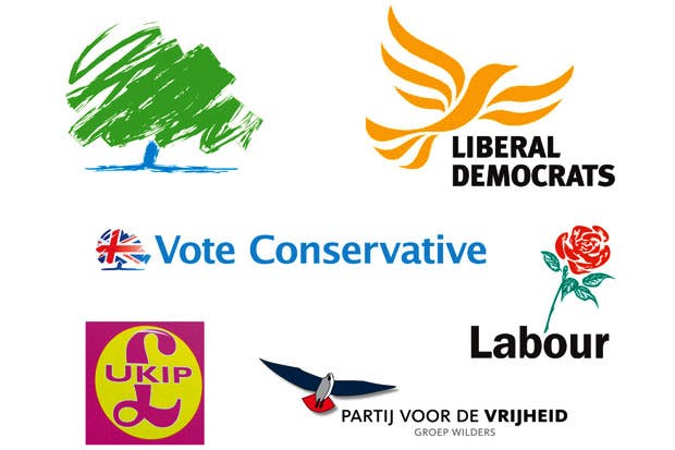
Now that the conference season is over, we can compare not just the party policies, but their logos too. Last week’s Tory conference taught us the patriotic adaptation of their tree — now draped in the Union Flag — doesn’t work any better than the original green-tree symbol. The old symbol demonstrated Conservative values as imagined by the Innocent smoothie design team.
Already a subscriber? Log in
Subscribe for just $2 a week
Try a month of The Spectator Australia absolutely free and without commitment. Not only that but – if you choose to continue – you’ll pay just $2 a week for your first year.
- Unlimited access to spectator.com.au and app
- The weekly edition on the Spectator Australia app
- Spectator podcasts and newsletters
- Full access to spectator.co.uk
Or









Comments
Don't miss out
Join the conversation with other Spectator Australia readers. Subscribe to leave a comment.
SUBSCRIBEAlready a subscriber? Log in