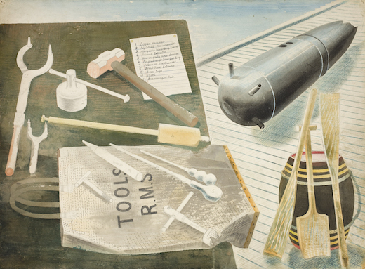
The most unusual picture in the exhibition of work by Eric Ravilious at Dulwich Picture Gallery, in terms of subject-matter at least, is entitled ‘Bomb Defusing Equipment’. In other ways — crisp linear precision, a designer’s eye for the melodious arrangement of shapes — it is typical of Ravilious. Characteristic, too, is the way he has given these implements associated with warfare and high explosives an almost jaunty air, shading into melancholy mysteriousness.
That’s the Ravilious note, and I must admit I find it irresistible. Ravilious (1903–42) was one of the most beguiling of mid-20th-century British artists. Yet it is still not quite clear what position he has in art history: high or low, important or insignificant. The other day in conversation a well-known painter, pausing to find the correct term for Ravilious’s pictures, settled on ‘slight’.
Perhaps she was correct, in that he was, in musical terms, more of a Cole Porter than a Webern. His work is light in mood, unpretentious in ambition, but also superbly crafted and individual. You can spot a Ravilious as easily as a Henry Moore or Ben Nicholson (to name two of his more obviously heavyweight contemporaries).
Picasso was once defined as a ‘painter/sculptor’. Ravilious, like his friend and stylistic confrère Edward Bawden, was a painter/designer. The Dulwich exhibition, though it mainly consists of watercolours, also contains such items as designs for a handkerchief, an alphabet mug done for Wedgwood in 1937, lithographs, wood engravings and book illustrations.
As an artist, he fits the category defined by Alexandra Harris ‘romantic moderns’ (exactly what many of the British would still love to be). Ravilious was romantic in subject and — to an extent — style; his aim was to emulate painters of the early 19th century. Bawden shared this. When I talked to him, near the end of his life, he said as much, ‘We knew the earlier painters, of course, Turner and the rest of them; there were masses of them, all very good.’
Ravilious was, indeed, a designer before he was a painter. He studied the subject at the Royal College of Art in the early 1920s (which is where he met Bawden, who was on the same course). In the first decade of his career, it was really his work in black and white that stood out. He did not find a mature watercolour idiom until the mid-1930s; and though his output was prolific, his life was short. He was reported missing, presumed dead, in September 1942, after a flight on which he was travelling as a war artist disappeared over the North Atlantic.
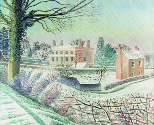
The influence with Ravilious was far more Cotman than Turner. He always had a clear linear structure to his paintings, a dry touch with his watercolour, a way of using patterning strokes that occasionally turned his skies to tartan, and was adroit at using white paper to evoke brilliant sunlight.
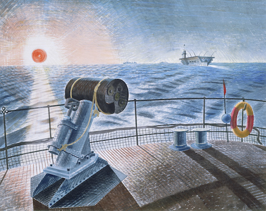
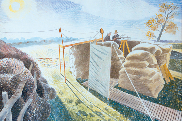
Ravilious loved machinery in a thoroughly modernist fashion. ‘Ship’s Screw on a Railway Truck’ (1940) is a fine example, but even before he became a war artist he was attracted to utilitarian aspects of the rural scene. His two marvellous pictures of the giants carved in the chalk at Cerne Abbas and Wilmington are seen through barbed-wire fences. And it is those sharp, framing lines that make the paintings.
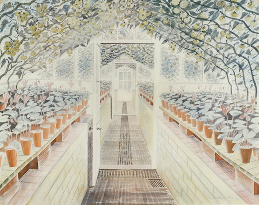
There was a hint, too, of surrealism, probably derived from Paul Nash. It is only an atmosphere in Ravilious, that air of mild strangeness which lingers for example over his pictures of plants growing in greenhouses. The feeling comes partly from the way his scenes are so often deserted, or if there are figures they are generally faceless or just silhouettes.
It was not that Ravilious couldn’t manage more naturalistic images of people, but when he did — in some of the lithographs from the ‘Submarine Series’ (1941), that hard-to-define Ravilious feeling fades. A diver, swaddled in a bulbous helmet and mustard-coloured suit, was much more his sort of thing.
Nash was bolder in his attempts to inject surrealism into English landscapes. But his efforts — such as an encounter between a tennis ball and a tree stump on the Dorset coast — could seem more silly than enigmatic. Ravilious, in comparison, had a marvellous sense of balance. The exhibition at Dulwich reveals that his was a limited talent, but he seldom failed (occasionally there is too much of the doll’s house or model train set about the pictures).
‘How strange the change from major to minor,’ as Cole Porter wrote in ‘Ev’ry Time We Say Goodbye’. In the wider scheme of things, I suppose Ravilious was a minor artist, but that doesn’t stop his work being delightful and — sometimes — just what you feel like.
Got something to add? Join the discussion and comment below.
Get 10 issues for just $10
Subscribe to The Spectator Australia today for the next 10 magazine issues, plus full online access, for just $10.
You might disagree with half of it, but you’ll enjoy reading all of it. Try your first month for free, then just $2 a week for the remainder of your first year.


Comments
Don't miss out
Join the conversation with other Spectator Australia readers. Subscribe to leave a comment.
SUBSCRIBEAlready a subscriber? Log in