In Australia, I have been told, the female pubic area is sometimes known as a ‘mapatasi’ because its triangular shape resembles a map of Tasmania. And since we are discussing cartography and the nether regions, it is wonderful to find in the British Library’s new exhibition, Maps and the 20th Century, that Countess Mountbatten wore knickers made out of second world war airmen’s silk escape maps.
Maps certainly colonise our imaginations in many different ways. The allies in Iraq had a ‘road map’ rather than a strategy. So much of personal value can be lost in the creases and folds of our own ‘mental maps’. And couples who often travel in cars will know the shrieking horrors of the map row, more complicated nowadays since satnav offers a third and often contrary route selection.
If you visit the British Library you might use the Tube or go by road. So you will probably consult the Underground map or an A-Z. Here are two examples of maps as illusions, or, at least, persuasive abstractions.
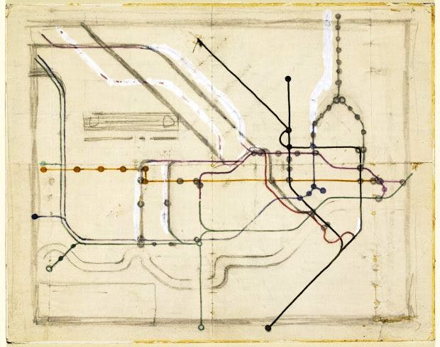
Harry Beck was the London Transport engineering draftsman who created the modern Tube map. With great art he decided to use only verticals, horizontals and diagonals while, for clarity, he greatly enlarged the city’s central area. The result is an all-time, trumpets-of-Jericho classic of graphic design, admired and copied everywhere.
But if you see a technical plan of the Tube lines as they actually are, it resembles a bowl of spaghetti spilt on the floor. The disparity between tangled ‘reality’ and Beck’s superlative, reductive modernist capriccio is shocking. It is not a faithful reproduction of underlying facts, but a lie that works. Therein is a central truth: the human mapping instinct is as much art as it is science.
Then there is Phyllis Pearsall’s A-Z, whose mapping protocols prioritise streets and diminish everything else. These popular maps are so familiar that we do not easily see how very odd it is to have, say, Fentiman Road given more pictorial status than Buckingham Palace. The A-Z is a map that assumes surface movement on roads between places is more important than the places themselves. If you were looking for a metaphor of the 20th century, it’s in there somewhere.
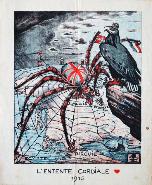
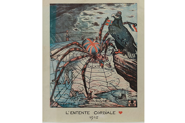
German propaganda poster: a spider with the face of John Bull devours a French soldier at Calais. Photo: British Library
Although maps were still a novelty circa 1900, the 20th century became their great age: of the four million maps held by the British Library, two thirds were produced in this period. War was a stimulus: in 1914 the British Expeditionary Force mapping department had a staff of one officer with an assistant. By the end of the first world war 5,035 million map sheets had been printed. Reporting on the military campaigns, newspapers began to reproduce maps. At about this time, geography became a university subject.
There is a weird beauty, a vicarious fascination, in a relief map of Ypres in 1916, produced by the Ordnance Survey in Southampton. It is a technically correct and amoral description of a theatre of atrocious carnage, but it is good to know that scarlet majors at the base had excellent intelligence about contour lines while speeding glum heroes up the line to death.
Or what about Luftwaffe aerial photographs of the Liverpool–Birkenhead region in 1940 with potential targets outlined in red? Haunting to see great buildings marked for demolition just hours before the bombs fell. Here was a map that told the future … of slums. In 2012 the National Archives launched an interactive Blitz map and an app that allowed you to point your phone at a building to see — a nice surreal touch, this — if it had been bombed in 1940.
Maps, of course, reveal the psychological states of their creators as much as they describe topography. Cartographers create maps and maps create our mindset. Thus there have been radical attempts to change perceptions. Was a third of the planet really once Imperial pink? During the second world war, the bizarre azimuthal equidistant projection showed the North Polar Sea at the centre of the world, with the continents all of a piece and trade routes and battlelines clearly drawn.
In the Fifties the Peters projection, dismissed by many academic cartographers as a prank, attempted to realign the world so as to give more consideration to territories neglected by convention. In the same decade, Guy Debord created psychogeography.
Popular travel has been as big a stimulus to map design and production as war. New generations of cyclists and motorists required data. Michelin encouraged people to burn more rubber by luring them to gastronomic destinations, providing fine maps to navigate their ‘voyage’ or ‘detour’ towards lunch or dinner.
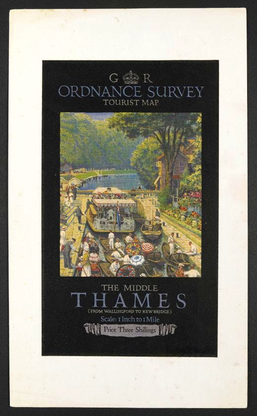
Twenties proofs of an OS tourist map. Photo: British Library
Personally, I find Michelin maps completely engrossing and when occasionally bored I will flip open an Atlas routier at, say, page 173 square G2 and begin a reverie about what it would be like to travel the D15 between Crosses and Jussy-Champagne. In Germany, they used to have charming publications called Ihr Zugbegleiter, a little map that showed what was rushing past the train window. Perhaps high-speed rail made it an impractical blur.
And then there is the poetry. In ‘The Hunting of the Snark’, Lewis Carroll writes:
He had brought a large map representing the sea,
Without the least vestige of land:
And the crew were much pleased when they found it to be
A map they could all understand.
It was, of course, a map that was completely blank.
Now new technologies are changing the parameters of what a map is. The first thing you see in the British Library is a population cartogram: a map that measures people, not the earth’s surface. Charles Booth’s Poverty Maps of London (1886–1903) were a prediction of new charts by the Italian architect Carlo Ratti, who quantifies internet traffic and redraws, say, Manhattan using bandwidth rather than street width as his measure. Ratti has also fitted air-quality sensors on bikes to produce pollution maps. A.A. Milne’s Hundred Acre Wood suddenly seems very distant.
These same new digital technologies mean that the 20th century’s output of paper maps is not likely ever to be exceeded, but there remains a very keen popular interest in mapping, coloured by a nostalgic sense of loss about a world the Ordnance Survey suggested existed circa 1935: a wholesome-looking chap with a pipe leans on a five-bar gate consulting a map in front of a thatched cottage with a picturesque lane leading into a wood.
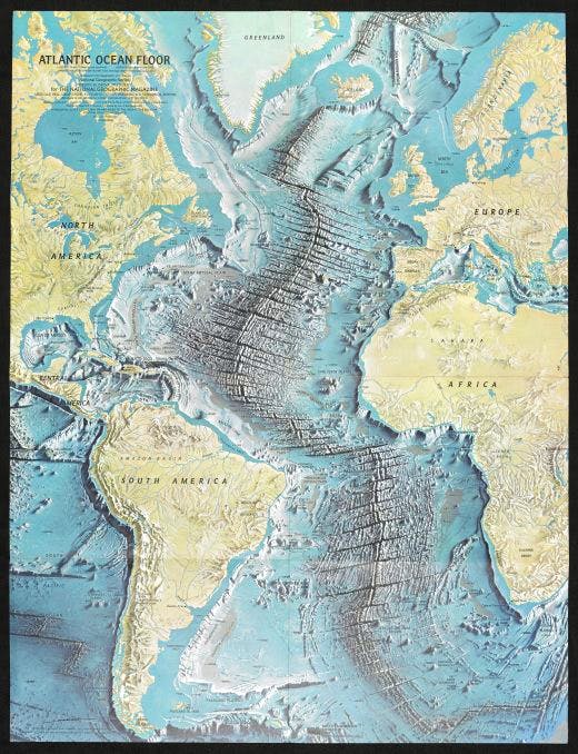
Map of the Atlantic Ocean floor, by Heinrich Berann, for National Geographic Magazine, June 1968. Photo: National Geographic
The best maps are not always objective and some are useless in practical terms. Herman Melville said: ‘It is not down in any map; true places never are.’ At just about the moment Google Earth removed all topographic secrets from the planet, a surprise bestseller of 2010 was Judith Schalansky’s Atlas of Remote Islands — Fifty Islands I Have Not Visited and Never Will. The subtitle is revealing; so, too, is the fact that Schalansky grew up in East Germany when travel was a fantasy.
And still we come back to psychological states. I have seen a scary Christian map of the world with its ‘impenetrable hedge of sin’ (where Satan installed dancing schools and delivered Sunday papers). Or think of Saul Steinberg’s marvellous 1975 New Yorker cover ‘View of the World from 9th Avenue’, with Manhattan at the centre of the world and insignificant China and troublesome Africa consigned to the peripheries. Meanwhile, Roald Dahl said that the reason they have blank pages at the back of atlases is ‘for new countries. You’re meant to fill them in yourself.’
Meanwhile, if not a new country, Europe is certainly changing shape. Since 2002 the euro coin has shown a map of the Continent including only EU members, which at the time included the British Isles. Of course, that must soon change to reflect political reality. And how very odd it will look.

