Two divergent approaches to printmaking are on view in an exhibition of graphic work by Francis Bacon and Lucian Freud at Marlborough Fine Art, Albemarle Street. For the former, media that depend on line, such as etching, were of little interest, since — as his friend Freud would point out — Francis couldn’t draw very well. But, Freud would add, Bacon’s painting was so brilliant that he made you forget that limitation.
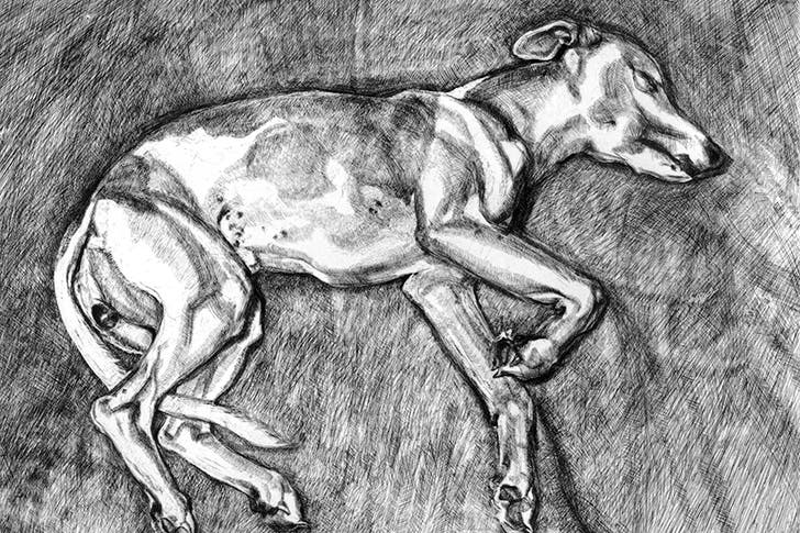
Bacon’s prints were essentially reproductions of his oils, signed and numbered by the artist. The etchings Freud made in the last three decades of his life were not like that at all. Though the models for the etchings were often the same as those for his paintings, his approach was entirely distinct.
Just as much time and thought went into each print as into a work on canvas (I should declare an interest, as the subject of one of those in this show, ‘Portrait Head’, 2005). Freud’s etchings, furthermore, were remarkably innovative. Working with a brilliant printmaker, Marc Balakjian, he would try out highly unorthodox techniques.
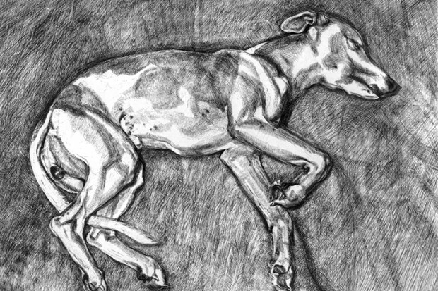
‘Self Portrait: Reflection’, 1996, is a case in point. The artist had posed for it in the mirror wearing a white shirt, but when a trial proof was pulled the large blank area at the bottom of the picture looked wrong, especially in contrast to the rest of it, which is very dark. The solution he finally found was for Balakjian to wipe that section lightly with an inky rag, so as to create a grey, mottled surface resembling cloth.
The effect is unique — as, indeed, is each individual impression, since Balakjian had to repeat the process whenever the plate went through the press. Freud’s etchings are still under-appreciated, despite the international acclaim for his work. But among them, it seems to me, are some of the strongest things he ever did.
The paintings of the South Korean artist Park Seo-Bo, on view at White Cube, Mason’s Yard, are a bit like that inked plate — without the self-portrait. He is one of a number of artists, mainly born in the 1920s and ’30s, whose work is known as Dansaekhwa, meaning ‘single colour painting’, or, as we say in English, ‘monochrome’.
Now, of course, there’s been an enormous amount of that over the past century. It’s curious that in Yasmina Reza’s play Art (currently being revived) a white-on-white abstraction bought by one of the characters is regarded as a scandalous innovation. Actually, the first such work was produced by Malevich during the first world war. Sixty years ago, Yves Klein was specialising in paintings consisting entirely of his own, patented International Klein Blue.
So there is nothing untoward about monochrome abstractions, but these Korean ones have an unfamiliar effect because they come from a culture with different traditions. In the Far East, the distinction between ‘abstract’ and ‘figurative’ is not quite the same. There a mark made with a brush on paper has always been felt to be expressive in itself. The works by Park Seo-Bo in this show consist of paper, worked into the paint surface so it looks like a big brushstroke. This group of pictures is made up of these, like vectors pointing in different directions. The monochrome shades used are quiet — mainly shades of porridge and grey — but nonetheless the pictures grow on you. There’s motion and energy in them.
Twentieth-century modernist art was an international phenomenon, reaching many parts of the globe: Korea, Japan, South America. A diverting exhibition at Two Temple Place demonstrates that it even reached Sussex. Almost every movement, it turns out, had followers of some kind on the South Downs.
It is hard not to reflect, however, as one goes round that the British avant-garde of the 1920s and ’30s — that is, before Francis Bacon came along — often had a distinctly amateur air. That is part of its charm but meant, for example, that the Bloomsbury artists Duncan Grant and Vanessa Bell were much more successful at home decorating than at serious painting. A linen chest painted by Grant somewhat in the manner of Matisse is one of the most beguiling items on show.
Décor was the strong point, too, in the wealthy collector Edward James’s surrealist mansion near Chichester, where you could relax on the celebrated sofa in the form of Mae West’s lips (like most modernist furniture, it looks far from comfortable). A square of the celebrated carpet woven with the damp footprints of James’s wife, the dancer Tilly Losch, is also on display.
Home — though not in a way that has much to do with Bloomsbury linen chests — is also the theme of House Work, a mixed exhibition at the Victoria Miro Gallery, St George Street, Mayfair. All the pictures on show depict dwellings. Most of the works are contemporary, indeed quite a few date from last year, although the earliest is a Chagall from 1926.
This selection is therefore bound together by subject matter rather than by movement or period. But a lot of the works have an affinity with the idiom of Peter Doig (a couple of his pieces are included). That is, they are done not in front of a building but from imagination, and have a loose, slightly, well, home-made look.
The message of the exhibition is that when people paint or draw houses, they are probably depicting something else — feelings, recollections, fears. Thus, Celia Paul’s ‘My First Home’ (2016) represents the bungalow in which she was born — in Trivandrum, India — seen through what looks like a haze of memory.
The fuzziness in a recent painting by George Shaw, on the other hand, is less warm and glowing. The painting depicts a dreary stretch of somewhere nondescript (which is, of course, its point). His title, ‘Study for Landscape with Fuck All’, though not one an estate agent would employ, fits quite a few places. In this country surroundings can be pretty monochrome too.
Got something to add? Join the discussion and comment below.
Get 10 issues for just $10
Subscribe to The Spectator Australia today for the next 10 magazine issues, plus full online access, for just $10.


Comments
Don't miss out
Join the conversation with other Spectator Australia readers. Subscribe to leave a comment.
SUBSCRIBEAlready a subscriber? Log in