Leonardo da Vinci thought sculpting a messy business. The sculptor, he pointed out, has to bang away with a hammer, getting covered in the process with a nasty mixture of dust and sweat. In contrast the painter can sit at his easel, dressed like a gentleman, and portray the whole wide world and everything in it. (Michelangelo, not surprisingly, disagreed.) Such spats were by-products of the paragone — a sort of Punch-and-Judy debate, much enjoyed in 16th-century Italy, about which of the arts was the most powerful.
Intriguingly, the National Gallery has revived the paragone in one section of its new exhibition, Monochrome. There are no works by Michelangelo or Leonardo included in this, but there are pieces by Jan van Eyck and Titian addressing that very same question: which can do more, painting or sculpture?
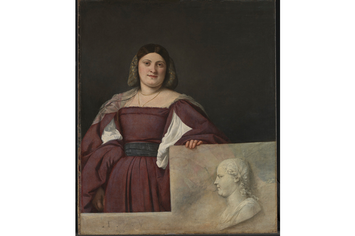
The latter’s ‘Portrait of a Lady’ (c.1510-12) shows a young woman standing behind a parapet. On this her profile is carved in the manner of an ancient cameo. Titian imitates the relief to perfection in oils, but the carving is cold and dry next to his depiction in living colour of her face, skin and soft flesh. You can almost hear the Venetian master quoting the lines of the old song to a defeated rival, ‘Anything you can do, I can do better’.
Van Eyck seems to be playing the same game in his ‘Annunciation Diptych’ (c.1433-5). One of the arguments made by defenders of statues was that you could see every side of them, whereas a picture could only show one. Van Eyck got around this by using reflections. He depicts a sculpted group of the Madonna and Archangel Gabriel in grey stone. But they are placed against a slab of highly polished black marble in which you can dimly see their back views reflected.
These figures are surrounded by a painted stone niche, around which is a real wooden frame. But van Eyck executed the very bottom of the plinth on which the figures stand on the real frame — so they seem to be edging just a little out into the real world.
Among other paintings brilliantly duplicating colourless carving are a huge detached fresco by Tiepolo and Mantegna’s delicate pastiche of a Roman bas relief ‘Introduction of the Cult of Cybele’ (1505-6), each exercising great skill in a limited palette (although Mantegna adds a rich backing of trompe l’oeil marbles veined in red and gold).
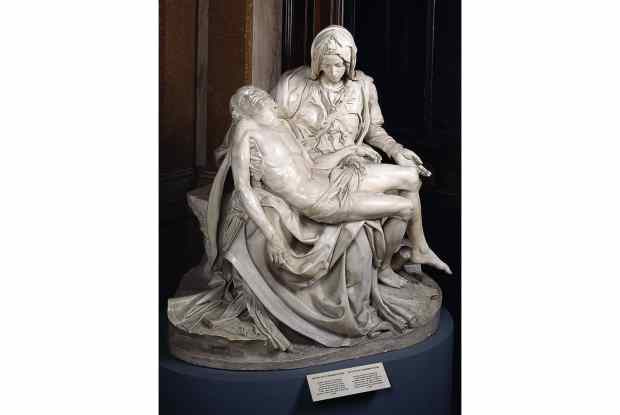
In the true spirit of the paragone there is even a straight comparison of the two arts: a painting by Bernardino Nocchi replicating a relief of the ‘Deposition’ by Canova, and next to it a copy of the same work in marble.
But there are other, and deeper, reasons than one-upmanship for artists to restrict the range of colour they use. Much of the interest of Monochrome lies in the investigation of why so many artists should have cut down their chromatic choices in this way. Partly, of course, the explanation is that the results can look magnificent.
Black is also a colour, as Matisse once pointed out. But it is more than that, a whole world of diverse shades; so is the grey-scale known in art as grisaille. Some artists, such as the young Bridget Riley and Frank Stella produced masterpiece after masterpiece just using black (there are examples by both in the show).
There is one other great advantage to turning down the colour knob. It changes what we see, and thus makes us concentrate harder. This is neatly demonstrated by Olafur Eliasson’s ‘Room for one colour’ (1997), an entirely yellow space lit by single-frequency sodium lights. At first glance it just looks like a piece of interior decoration in a startling shade of egg-yolk.
Then you notice that your fellow visitors — and you — are strangely transformed. Every surface that is not sunshine-hued becomes a bilious grey. This certainly makes faces appear strange, but also forces you to notice things about them — the twist of a nose, the sag of a jowl — that normally you might not (the artist encourages photography inside this work, but selfies are definitely not recommended to anyone remotely vain).
Perhaps for similar reasons, Renaissance artists such as Beccafumi sometimes did monochrome sketches for paintings. Cutting down on colour made it easier to concentrate on form, which must also be the explanation for van Eyck’s ‘Saint Barbara’ (1437).
This has long been a puzzle and source of controversy among scholars because it is hard to say just what it is. The picture is a superbly fine drawing in ink, oil and silver-point on a panel: a filigree spider’s web of landscape, figures and intricate gothic architecture, framed exactly as if it were a painting. Just the sky is actually brushed in colour.
Is it unfinished, then? This seems unlikely, because it would be bizarre to begin with such a phenomenally intricate under-drawing. The answer must be that van Eyck wanted us to concentrate on this linear detail as a wonder in itself — which indeed it is.
With most exhibitions the problem is that they are too big. So it is a tribute to Monochrome that you leave wanting more. It would have been good to have works by such black on black specialists as Franz Kline, John Virtue and Ad Reinhardt, for example. This is a delightful and thought-provoking demonstration that — to adapt an old slogan — black and white are beautiful (and grey is too).
Got something to add? Join the discussion and comment below.
Get 10 issues for just $10
Subscribe to The Spectator Australia today for the next 10 magazine issues, plus full online access, for just $10.
You might disagree with half of it, but you’ll enjoy reading all of it. Try your first month for free, then just $2 a week for the remainder of your first year.


Comments
Don't miss out
Join the conversation with other Spectator Australia readers. Subscribe to leave a comment.
SUBSCRIBEAlready a subscriber? Log in