It is easy to assume that the contours of art history are unchanging, its major landmarks fixed for ever. Actually, like all histories it is a matter of shifting perspectives. As we move through time, the view backwards constantly alters.
The rising and falling critical estimations of the painter Richard Smith are a case in point. Had you asked an art-world insider in 1963 who the brightest rising star of British art was there is a strong chance — though other names such as David Hockney might have been mentioned — that the answer would have been Smith (1931–2016).
Appropriately, 1963 is the end date of an excellent little show at Hazlitt Holland-Hibbert gallery. This collates many of the most impressive pictures from Smith’s earliest and most seductive period. At that time he was working in a fluid boundary zone between what was later termed ‘colour field abstraction’ and what was about to be dubbed ‘pop art’. The pictures often take the form of hugely enlarged, softly atmospheric studies of packaging.
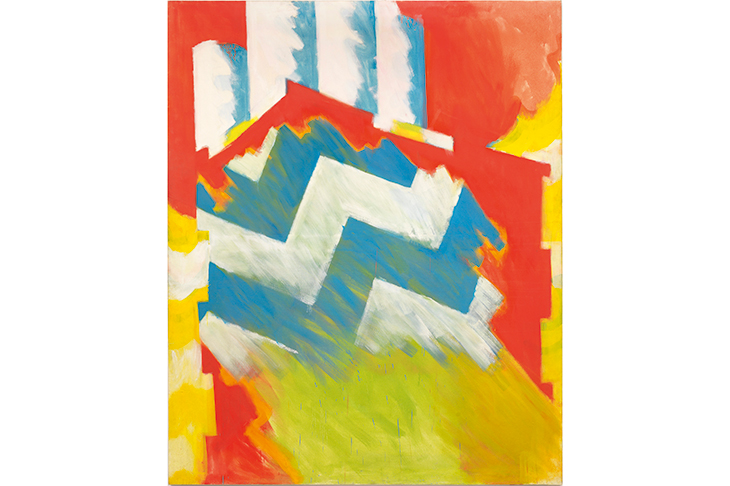
‘Flip Top’ (1962), for example — a favourite of mine — is a wall-sized image based on a then novel type of cigarette packet. That information alone places it in a distant age when advertising and the paraphernalia of consumerism seemed new and exciting. But the pop art aspect of Smith’s work is not the most important or lasting. Indeed, so close was he to that frontier with abstraction that it would be possible to look at most of these pictures without noticing their origins in advertising or cartons.
The qualities that make them special are hard to define. They include what painters call ‘touch’ — that is, the way Smith put paint on a canvas. His brush strokes are sometimes loose and free, but they are also hazily atmospheric. And the colours — lime greens and telephone-box reds prominent — are bright but simultaneously soft. Those hues, more than anything else, seem to announce the coming age: the 1960s.
The following decade was Smith’s golden period. He was the British representative at the Venice Biennale in 1970, and subject of a Tate retrospective in 1975. After that, he moved to the USA, and his art and name fell into the oblivion that awaits ex-stars in any field.
He was one of those artists who are on top form for a limited time. In Smith’s case, the best work came from more or less exactly the years covered by this exhibition. But his work is still admired by his peers and contemporaries (Peter Blake, Allen Jones and Hockney were among those who attending the opening). These early paintings still look fresh and strong.
The American artist Richard Pousette-Dart has, like Smith, tended to be relegated to the league of art-historical also-rans. But he is present in the celebrated photograph of the abstract expressionists taken in New York in 1950, a youthful figure standing at one side not far from Jackson Pollock. Then, obviously, he was considered a player. Nowadays Pollock, Mark Rothko and several others in the group are familiar names throughout the world; few, in this country at any rate, will have heard of Pousette-Dart.
An enterprising exhibition at Kettle’s Yard, Cambridge, offers an opportunity to assess him. His, however, turns out to have been a slightly different case from Smith’s. The latter flared brilliantly, but for only a few years. Pousette-Dart, in contrast, emerges as one of those who suffer from having talents that were too many and too varied.
In addition to painting, the exhibition includes examples of sculpture and photography. It is true, as is pointed out in the catalogue, that if you had compared Pousette-Dart and Pollock in the early 1940s, you would have concluded that they were rather similar painters — and perhaps that Pousette-Dart was the more talented.
A work such as ‘Within the Room’ (1942) is much like an early Pollock — a dense stew of symbols and geometric and organic forms. But it isn’t an imitation. Clearly the two were then moving on parallel tracks. The difference is that Pollock managed to leap to a higher level, whereas Pousette-Dart did not. This was as good as he got. But though there are no towering masterpieces, this is an enjoyable exhibition, full of engaging things such as the small, flat brass pieces he made — art you could slip into your pocket. The photographs are striking too.
Abstract expressionist photography is an improbable-sounding area, but not a bad description of what Pousette-Dart was doing in his portrait of Mark Rothko (c.1950), double exposed and looking in two different directions against a background of cloudy forms like ink blots or shadows. I also liked his 1955 shot of the trumpeter Thad Jones, playing his instrument and clad in a marvellous stripy shirt. Undeservedly forgotten jazz musicians, though, are a theme for another column.
Got something to add? Join the discussion and comment below.
Get 10 issues for just $10
Subscribe to The Spectator Australia today for the next 10 magazine issues, plus full online access, for just $10.
You might disagree with half of it, but you’ll enjoy reading all of it. Try your first month for free, then just $2 a week for the remainder of your first year.


Comments
Don't miss out
Join the conversation with other Spectator Australia readers. Subscribe to leave a comment.
SUBSCRIBEAlready a subscriber? Log in