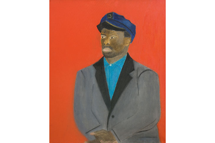
One of the most extraordinary paintings in the exhibition of work by Craigie Aitchison at Piano Nobile (96–129 Portland Road, W11) is entitled ‘Georgeous Macauley in Blue against a Red Background’ (1968). It depicts the sitter, a Nigerian who was Aitchison’s favourite model of the 1960s and ’70s, wearing a peaked cap and double-breasted jacket. The catalogue quotes a reminiscence by the artist which provides a partial explanation of the headgear. ‘He wanted to be a traffic warden, and I said, “Why do you want to go about in the rain doing that?” And he said, “Because you get a uniform.”’
The art and life of Aitchison (1926–2009) were all like that: perfectly logical and at a unexpected tangent from normality. Some of his paintings could pass for colour-field abstraction of the kind produced by artists such as Barnett Newman. In this picture the wonderfully named Georgeous Macauley is placed against a field of deep scarlet. ‘Dog in Red Painting’ (1974–5) is exactly what the title suggests. Almost the whole surface is covered in different and dense reddish shades, a rich fuchsia at the top, then an orangey stripe with crimson below that. In the 1970s this work would almost have passed for avant-garde, except for a large white Bedlington terrier in the lower right.
Aitchison fell in love with that breed after seeing a picture of one in a programme for a dog show. ‘Now I’ve got three,’ he once explained to me, ‘because you keep the puppy when you shouldn’t.’ He added: ‘I suppose they turn up in my work because they are here.’ Aitchison’s entire career had an inconsequential quality.
His father, Craigie Mason Aitchison KC, was a distinguished barrister, Labour MP for Kilmarnock and eventually a law lord. He was good at getting people off murders, Craigie told me approvingly, recalling an occasion when his mother had phoned up, and told him: ‘You know that man your father got off? He’s just shot his mother-in-law, himself and someone else.’
Initially Craigie had attempted to follow Lord Aitchison to the bar — which seemed an extremely implausible choice of occupation when you met him in later life, pottering around his dilapidated Victorian house in Kennington, which was decorated in the colours of his paintings and crammed with china dogs, real dogs, plus kitschy ceramic Madonnas and crucifixes. After failing various exams, Craigie decided to go in for pictures instead. Soon he found his way to the Slade, where it was quickly noticed that he was a remarkable natural painter.
His mature style had some affinities with the work of the talented fellow students he encountered in the early 1950s, such as Michael Andrews, Euan Uglow and Victor Willing. Andrews and Uglow are featured in a parallel exhibition at Piano Nobile’s other gallery across Portland Road, which focuses on artists shown in the 1960s by Helen Lessore’s Beaux Arts Gallery. Simultaneously, there is a pioneering retrospective of Victor Willing’s work at Hastings Contemporary (until 5 January). But like the nebulous ‘School of London’, there turns out to be no clear connection between these brilliant Slade contemporaries except that they all knew each other and were — more or less — ‘figurative’.
The mix of ingredients in Craigie’s art seems to have been utterly intuitive, not to say capricious. For example, there is quite a strong influence from Italian 14thand 15th-century painting (which he shared with many post-war British artists). At first, Craigie was utterly uninterested in old masters; then he went on a journey to Italy with a fellow student, Myles Murphy, who did like that kind of thing. Murphy suggested that Aitchison should wait outside various churches, while he went in and looked at the frescoes. Eventually Craigie got bored with this arrangement, went in and discovered Giotto.
The people and objects in his pictures —the Bedlington terriers, flowers, birds chocolate eggs and the crucifixes — were there because he liked them and liked to paint them. It wasn’t the religious subject matter, precisely, that moved him in pictures such as Mantegna’s ‘Dead Christ’ and Piero della Francesca’s ‘Resurrection’. It was the sadness, the ‘weight of feeling’.
To be honest, I haven’t a clue where to place Aitchison art historically. Perhaps that’s why he barely features in my book Modernists & Mavericks about post-war painting in London. He seemed too eccentric to fit even into a study of individualistic outsiders. Some of his pictures, at first or even second glance, can seem naive. But the best have power and clarity, sharp lines and brilliant saturated colour. With Craigie it is hard (as it also is with Uglow, Willing and Andrews) to answer the question: is this major or minor? Perhaps, even years after their deaths, it is still too early to say. But here is an excellent opportunity to take another look at his work.
Got something to add? Join the discussion and comment below.
Get 10 issues for just $10
Subscribe to The Spectator Australia today for the next 10 magazine issues, plus full online access, for just $10.
You might disagree with half of it, but you’ll enjoy reading all of it. Try your first month for free, then just $2 a week for the remainder of your first year.


Comments
Don't miss out
Join the conversation with other Spectator Australia readers. Subscribe to leave a comment.
SUBSCRIBEAlready a subscriber? Log in