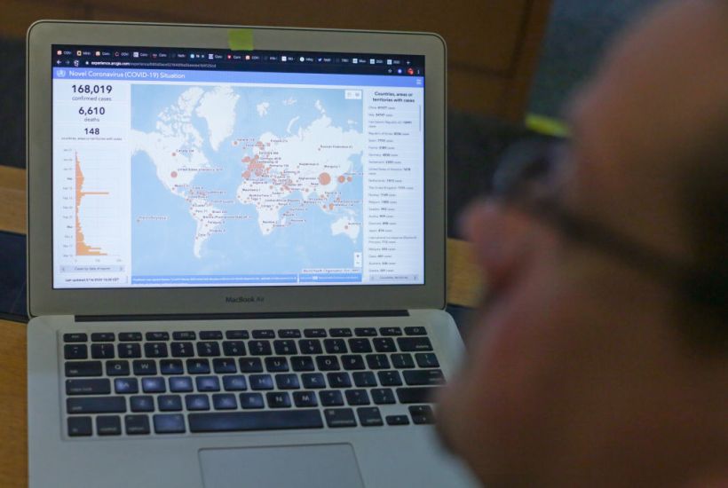
I was inspired to write this piece by a chart made by the historian James Barr. It showed, in the style of the Financial Times’ graphs of coronavirus cases and fatalities in different countries, a comparison of ‘Apples, Pears and Rhubarb’. What was meant as satire perfectly summed up why it is so unwise to compare coronavirus outcomes in different countries.
Now with new **data**
Already a subscriber? Log in
Subscribe for just $2 a week
Try a month of The Spectator Australia absolutely free and without commitment. Not only that but – if you choose to continue – you’ll pay just $2 a week for your first year.
- Unlimited access to spectator.com.au and app
- The weekly edition on the Spectator Australia app
- Spectator podcasts and newsletters
- Full access to spectator.co.uk
Or


Comments
Don't miss out
Join the conversation with other Spectator Australia readers. Subscribe to leave a comment.
SUBSCRIBEAlready a subscriber? Log in