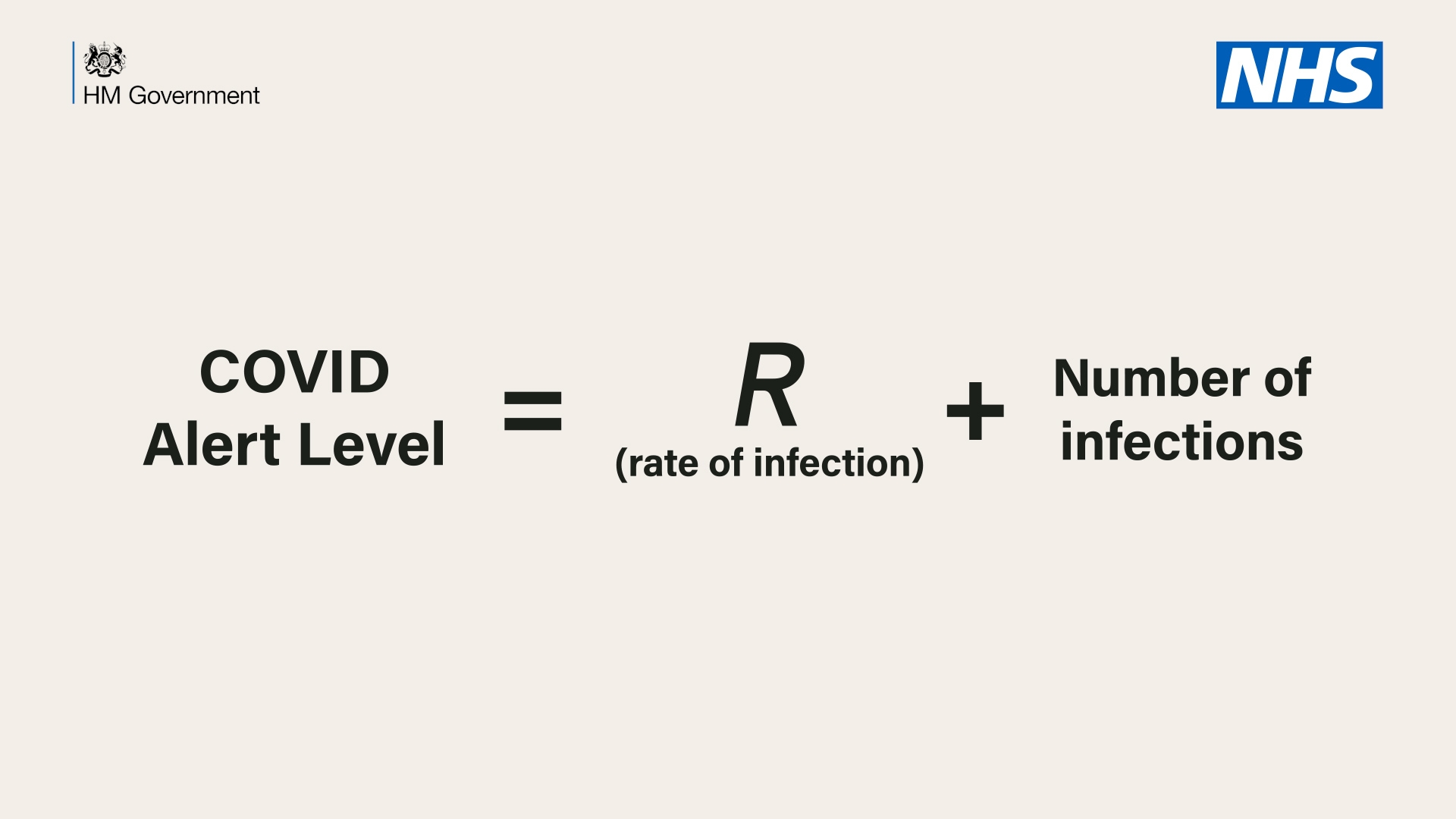
Following the Prime Minister’s address last night, Twitter was ablaze with mockery of the equation the government will use to determine our route out of lockdown.
⬇️ THREAD ⬇️
To chart our progress and to avoid going back to square one, we are establishing a new COVID Alert System run by a new Joint Biosecurity Centre.
That COVID Alert Level will be determined primarily by R and the number of coronavirus cases. #StayAlert pic.twitter.com/HZAY10MF5j
— Boris Johnson #StayAlert (@BorisJohnson) May 10, 2020
In particular, people were keen to show their mastery of primary school-level maths, by observing that ‘if the number of infections is 183,000 and R is 0.7, our threat level is 183,000.7 – how does changing R change the threat level?’ Others were quick to point out that: ‘R is a ratio and the number of infections is an integer so it’s meaningless to add them.’
However, at some point during their GCSEs they must have nodded off, because they would otherwise have encountered complex numbers, which show that it is perfectly possible for the government’s formula to work mathematically.
A complex number has a real part (the everyday numbers with which we are familiar) and an imaginary part (which is a multiple of the square root of minus one). We now teach this to schoolchildren, but the idea that you could add these two types of number together was once a highly contentious matter. In fact, the term ‘imaginary number’ was coined by René Descartes as a derogatory term.
But mathematicians eventually learned to work with these numbers, often placing them within the ‘complex plane’, like the below:

On this basis, we can see that we simply need to treat the Covid alert level as a kind of complex number and plot it on a 2D plane. I have created an illustration of how this might look, though it is not based on any particular knowledge of government policy.

Highlighted in blue is the position the UK is currently in, with our number of confirmed infections and a broad estimate of R being close to 1. As can be seen on the graph, that places us around the transition from red to orange – the level the Prime Minister suggested the country was in on Sunday evening.
If I were going to quibble with the government’s equation, I would argue that it misses a step by failing to map the complex number to the appropriate response band, but I doubt that could be easily communicated, nor does it need to be for most people.
The quality of government communications is easier to argue with. I think a chart like the above could be understood by most people. And by daring to go into slightly more detail, the government could save itself from the aggravation of critics determined to misunderstand its intentions.
Got something to add? Join the discussion and comment below.
Get 10 issues for just $10
Subscribe to The Spectator Australia today for the next 10 magazine issues, plus full online access, for just $10.


Comments
Don't miss out
Join the conversation with other Spectator Australia readers. Subscribe to leave a comment.
SUBSCRIBEAlready a subscriber? Log in