Consider the carpet. In all likelihood, you usually don’t. It’s simply something beneath your feet, soft or scratchy, bright or beige, thick or thin. But in a new book, Bill Young asks you to pause and really look at a particular genre of floor-padding: the carpets in the hotels around the world. In Hotel Carpets, the long-neglected designs pop from the pages.
Young, a corporate pilot, would often send pictures of hotel carpets to his wife and daughter while he was travelling. ‘Because I spend most of my life in hotels, that’s just one thing that was sticking out,’ Young says, in a video interview from his home in Dallas, where he’s been mostly grounded of late, due to the pandemic. ‘It’s one of those things where if you don’t notice something, you don’t really think about it, but once you start noticing, you see them everywhere.’
He began to document these on an Instagram account, @myhotelcarpet, which he estimated had about 80 followers for two years. Then, in 2017, his daughter posted on Twitter that all she wanted for Christmas was for the account to go viral. It did. Young gained hundreds of thousands of followers almost overnight, something he attributes in part to people seeking relief from ‘a negative news cycle’. He kept posting as he flew around the world, staying in hotels that ranged from the Marriott in Nagoya, Japan, to the Canyon Creek Country Club in Richardson, Texas. (‘I’ve spent five years of my life in Marriotts over the last decade,’ he says.) Young was even invited with his wife and daughter to Marriott headquarters to play a small role in their design process for a new carpet in a hotel located in Austin. This improbable trajectory has now led to a book, published by Hoxton Mini Press, that collects photos of the patterns Young has taken over the years into what he calls a ‘coffee-table carpet book.’
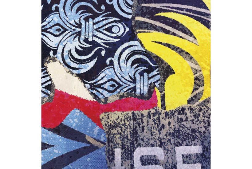
Hotel Carpets is an unconventional series of postcards from around the globe, featuring views of the ground instead of traditional vistas. The patterns are mesmerising and as associative as an inkblot test or cloud-shapes in the sky. Young’s particular point of view may come from being a pilot who is often peering out of the cockpit. ‘I look down at the earth a lot and so that’s kind of how I see. There’s one that looked like the top view of a mountain, like Fuji in Japan,’ he says. ‘Somebody else looks at it, and they’re not used to looking at it from above like I am, and they’ll say it looks like soundwaves, or TV static.’ Where Young gets a ‘strong sunset vibe’ from a carpet’s red-yellow-blue patterning, I immediately saw the strings of a harp.
There is a certain folksiness to the book, and to Young, who is quick to tell you that he’s no expert. ‘I’m decent photography-wise, but if you asked me to design a colour pattern for the living room, or the bedroom, that’s my wife’s purview,’ he says. ‘I’m not that good at that.’ (He describes the carpets in his house as ‘very beige’.) In the text accompanying the photos, his observations include personal anecdotes and jokes. Next to a carpet with a dark background and light swirls, he wrote: ‘The carpet looks like somebody spilled a large bowl of ramen on the floor. That makes me sad, I love ramen.’ It’s hardly the language of a typical design treatise, but this ordinary-ness is part of the appeal of Hotel Carpets. It does not pretend to be a book by an expert, or to provide a comprehensive design history of the hotel carpet, or to elevate its subject matter too much. Young simply and straightforwardly describes his impressions and presents his pictures. ‘One of the hardest things is keeping the shadows of my feet out of them,’ he says.
What is there to see here? Certainly variety: stripes and flowers and swirls and ordered diamonds and lattice-like patterns of lace and one that looks quite a bit like the cover of Pink Floyd’s Dark Side of the Moon, if it were all in yellow. There are some regional distinctions. A carpet in Austin, Texas, pays homage to the flocks of bats that make their summer home on local bridges. One at a Vegas resort features a pair of black-stockinged legs against a red keyhole. The carpets are grouped in the book so that there’s some resonance of colour and pattern, even among those that are thousands of miles apart. A brown background bisected by two red wavy lines in Munich looks like the quieter cousin of a deep brown and dark red carpet in Vegas. To me, both seem to depict veins of blood snaking across skin, but if you have a less morbid imagination, perhaps you see them instead as an aerial view of highways lit up by night-time traffic.
All in all, in this selection of hotel carpets we can see a kind of design that is out of vogue: bright colours, patterns, texture, clashing and mishmashed tones. They are loud. Some of them are really quite ugly. But they are not monotonous or homogenous in aggregate. They are not ‘minimalist’, a phrase that gets thrown around to describe the pared-down and sleek designs that dominate coffee shops all over the world. Critic Kyle Chayka coined the term ‘AirSpace’ to describe the globally uniform symbolic economy that has filtered into mainstream design, generated in part by technology. ‘It’s the realm of coffee shops, bars, startup offices and co-live/work spaces that share the same hallmarks everywhere you go: a profusion of symbols of comfort and quality, at least to a certain connoisseurial mindset. Minimalist furniture. Craft beer and avocado toast. Reclaimed wood. Industrial lighting. Cortados. Fast internet,’ he wrote. Hotel carpets are not AirSpace. They represent an earlier kind of mass-market design, one that was prevalent in the 1980s and 1990s, one that I might call ugly-beautiful. Seeing it today is refreshing.
Hotel carpets of this kind may not last. Young says he’s noticed that the colour is draining out of newer carpets, and that more hotels are eschewing them altogether for hardwood floors. But there is a practical reason to hope that they might endure. ‘The hotel carpets are designed to hide stains and traffic and wine and all things that travellers bring with them from outside the hotel,’ he says. They’re functional, then, in their patterned and bright form. Paring them down would defeat the purpose.
What I like best about Hotel Carpets is that it takes seriously — though not too seriously — culture that exists in the background. Most of our everyday aesthetic encounters tend not to be the direct contemplation of an art object. Instead, culture comes to us in unexpected ways: a snatch of background music in a coffee shop, a sculpture we happen upon in an airport, an image on a billboard that we only half-see as we drive past. These background impressions are usually ignored or dismissed, and ‘art’ remains confined to institutional spheres or particular moments. But here the background becomes the foreground, and it serves to illustrate the power of stopping to look and contemplate the ordinary.
Got something to add? Join the discussion and comment below.
Get 10 issues for just $10
Subscribe to The Spectator Australia today for the next 10 magazine issues, plus full online access, for just $10.
Hotel Carpets by Bill Young is published by Hoxton Mini Press.
You might disagree with half of it, but you’ll enjoy reading all of it. Try your first month for free, then just $2 a week for the remainder of your first year.


Comments
Don't miss out
Join the conversation with other Spectator Australia readers. Subscribe to leave a comment.
SUBSCRIBEAlready a subscriber? Log in