On Saturday, The Guardian reported that ‘The final decision about 19 July [Britain’s “Freedom Day”] will be taken on Monday morning, based on modelling from the Scientific Advisory Group for Emergencies (SAGE) about Covid cases and pressures on the NHS’. I spluttered into my morning coffee on reading that. It’s beyond belief that given their abysmal track record, SAGE wasn’t unceremoniously disbanded at the end of 2020 and whoever is responsible for assembling that incompetent group fired as well. Are cabinet ministers not capable of asking for an ‘audit’ of past predictions when they assemble to evaluate the latest state of play on the coronavirus situation in the country? They’ve made crucial decisions for 18 months that impact every sector of society, without impact assessments on even the rest of the health sector, let alone all other key sectors.
In Australia federal and at least some state treasuries have done cost-benefit analyses but governments refuse to publish the same. As no government hides an analysis that supports its narrative, the broad conclusion is obvious even though the details remain hidden from the people who pay for it all, in health, economic and social outcomes.
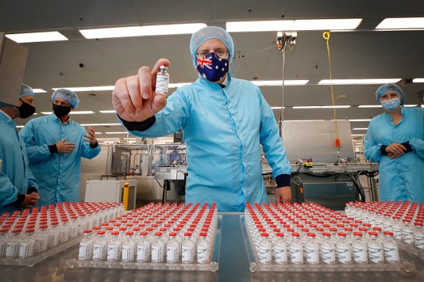
The Australian federal government has commissioned modelling from the Doherty Institute on vaccine threshold settings. The preference is for a ‘staircase’ approach that begins with small, staggered changes and gradually builds up to lifting major restrictions. Prime Minister Scott Morrison quite rightly said: ‘Only government leaders can balance all the needs and risks for both the economy and the health system’. It would help if we could see some evidence that such assessments are being done. It would also help if either Morrison or journalists would reassure us that the Doherty Institute’s track record has improved since the first modelling that propelled last year’s lockdown measures.
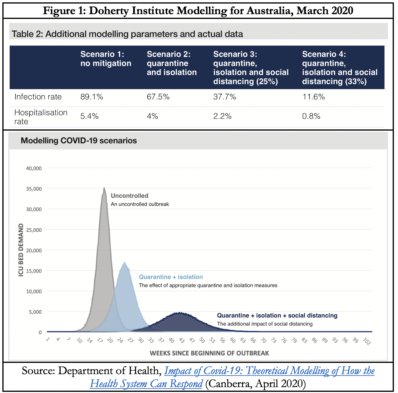
Under their best ‘Scenario 4’, around three million Australians should have been infected and over 200,00 hospitalised. Against this, the actual situation as of 10 July was just 31,100 (0.12% of the population) confirmed cases – a hundred times less than the predicted outcome. Similarly, under the most optimistic scenario, ICU occupancy was projected to be just under 5,000. In fact it peaked at 96 beds on 6 April 2020, with a total of 448 people hospitalised with Covid-19 on that date. Highest daily cases< were 552 (7-day moving average) on 4 August 2020 and the highest number of daily deaths was 22 on 3 September 2020. Michael Levitt, a Chemistry Nobel Laureate, was on the mark with his caustic comment: ‘It seems that being a factor of 1000 too high is perfectly OK in epidemiology, but being a factor of 3 too low is too low’, because ‘they see their role as scaring the people into doing something’.
As of 9 July, only 8.5% of Australians were fully vaccinated, compared to the EU average of 38.4%, US 47.4% and UK 50.6%. Professor Tony Blakely told SkyNews that modelling indicates we need a 70% vaccine coverage, ‘preferably with kids’, in order to open up our international borders to half the pre-pandemic arrivals of vaccinated people without quarantine requirements. Big Pharma must be poppping champagne corks at statements from such policy-influential health experts. Where is John ‘You cannot be serious’ McEnroe when we need him? Set aside the casually callous inclusion of children among the vaccination target groups, about which I’ve written previously. Look closely at the three mortality curves in Figure 2 from the UK and India. Their gradients are strikingly similar. (The explanation for the sudden jump from 9–16 June is the announcement of financial compensation to families of those who had died of Covid in some of the largest states. As always with the vaccines, follow the money!)
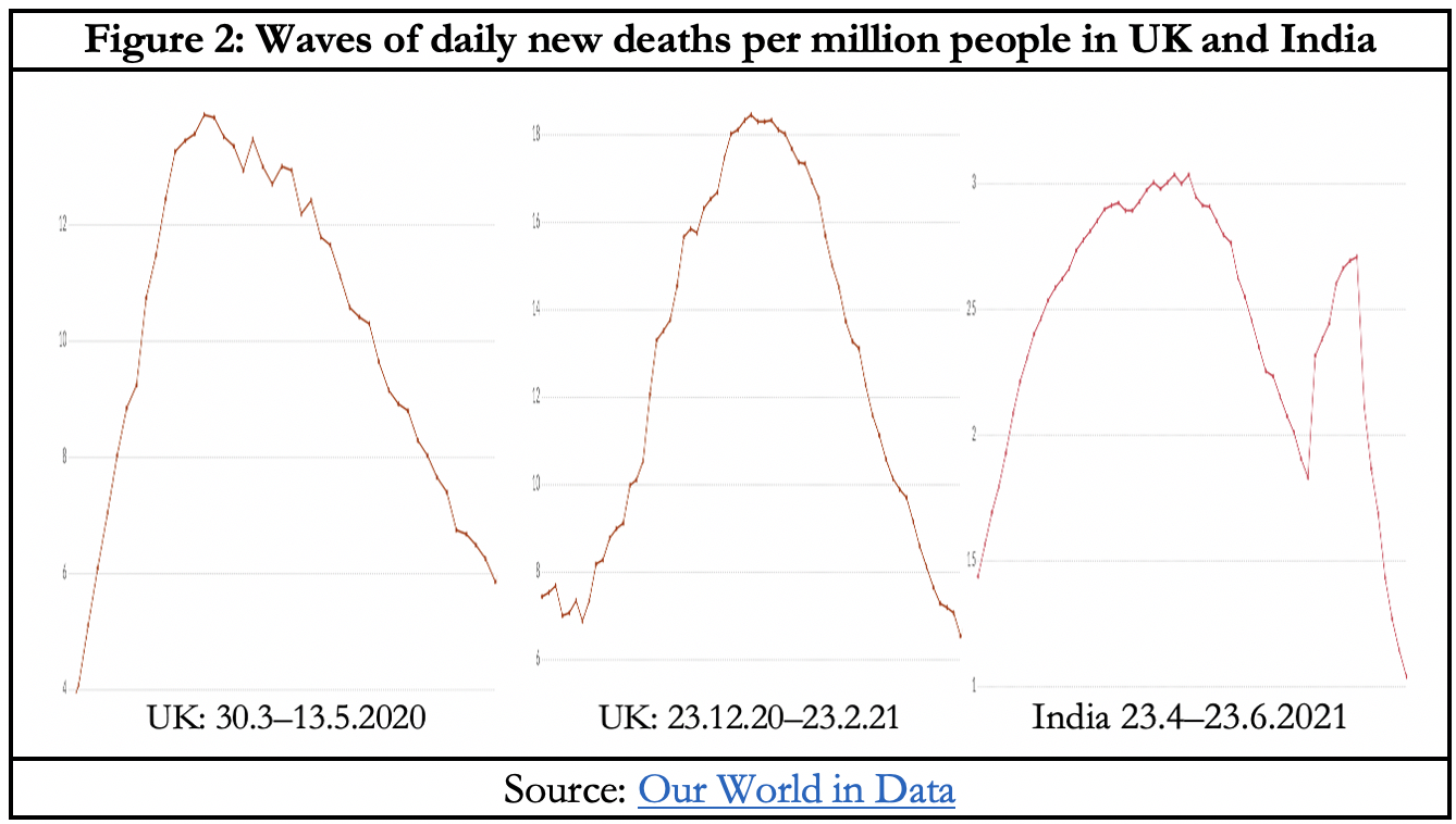
In April–May last year, Covid-19 vaccines were yet to be discovered. During this year’s wave, the UK’s daily new Covid deaths peaked on 23 January at 18.46 deaths per million people (DPM). If vaccines require a 14-day window to begin showing results, then the relevant vaccine coverage is on 9 January when, with 13.29 DPM, just 13.3% of people had been given at least one dose and an insignificant 0.5% were fully vaccinated. On 9 July 5.1% of Indians were fully vaccinated and 21.6% had been vaccinated at least once. Informed speculation has it that ivermectin may deserve more credit than vaccines in driving down India’s Covid mortality, although it could just as easily be yet another example of ‘virus gonna virus’. Is the case for the efficacy of vaccines really that much stronger than for ivermectin? Affordability, access and short-term safety are no contest between the two and long-term vaccine risks are a ‘known unknown’.
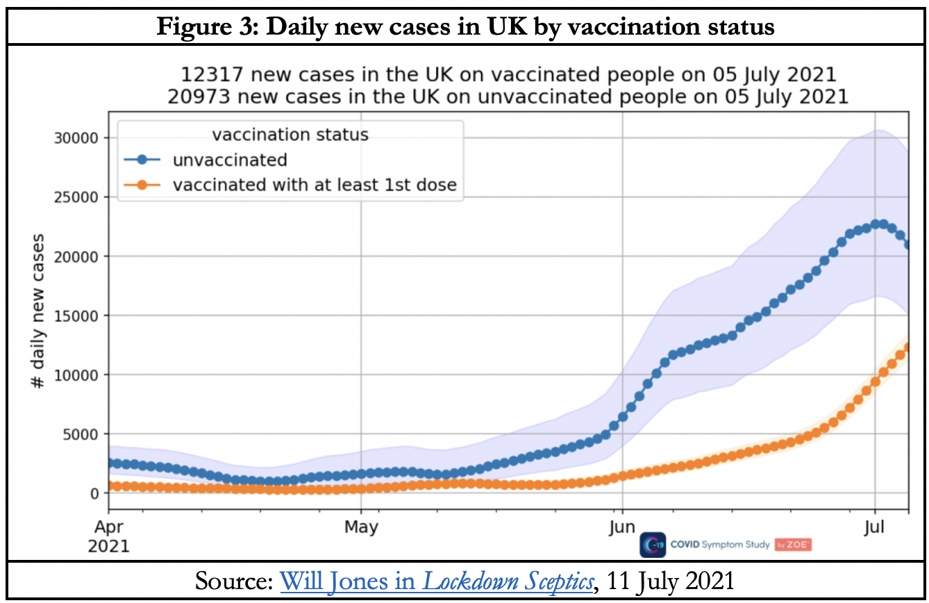
Now let’s look at something very interesting that’s just starting to show up in the UK. According to one data set, new symptomatic daily infections among the unvaccinated has plateaued and begun to fall in the UK, while among those 67% vaccinated at least once, it has surged (Figure 3). Yet the chart simultaneously confirms that the unvaccinated are less than one-third the total population, yet outnumber the vaccinated in the total number infected. Thus it is at once suggestive of vaccine effectiveness in reducing infections and a repudiation of the argument for vaccine apartheid through digital certificates. In addition to the philosophical-ethical arguments against the idea as Rocco Loiacono discussed, there may be little practical benefit from it: after a short time lag, the rise in infections occurs among the vaccinated.
This confirms that the steep fall-off in the mortality curve had little to do with vaccines. At peak on 23 January, still only a handful of 0.7% were fully vaccinated and a month later, when the DPM had fallen to 6.55, the fully vaccinated were still under 1%. By 9 July, however, 50.6% were fully vaccinated and the DPM had shrunk to 0.38. The mortality curve shows a similarly steep rise and fall in India from 23 April–23 June 2021, yet with a substantially lower full vaccine penetration of 1.5% on 23 April, 3.0% on 23 May and 3.7% on 23 June.
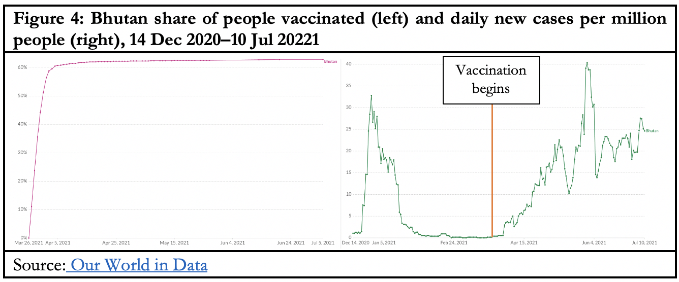
Next, let’s look at some dramatic examples of the stubborn refusal of infections to fall despite high vaccination rates, and sometimes actually surge, for which no satisfactory explanation is available. Bhutan began its AstraZeneca vaccine rollout on 26 March, achieved 60% coverage of a single dose in one week and is currently at around 63%. Its 7-day rolling average of daily new cases per million people (CPM) was 1.1 on 14 December, shot up to 32.8 on 27 December but had fallen to 0.37 by 26 March. On 30 May – two months after 60% vaccination coverage – it had hit a peak of 40.4.
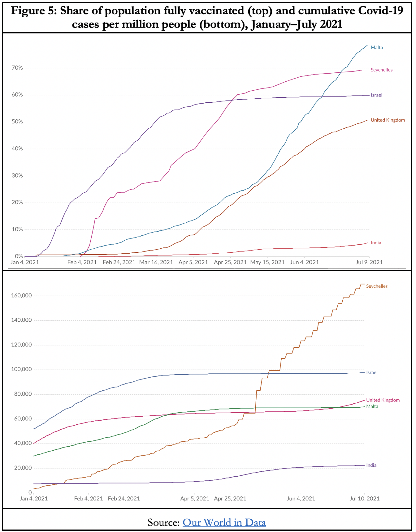
Of the four countries in Figure 5, India with 5.1% full vaccination had 30 CPM, compared to 50.6%-430 for the UK, 60.%-50 for Israel, 69.5%-1194 for Seychelles, and 78.5%-70 CPM for Malta. Vaccines may not be the promised panacea after all. Two-thirds of Israelis have been given at least one dose of a Covid vaccine. The coverage rises to around 85% for 20-49 year olds and over 90% for those over 60. For the week of 27 June to 3 July, the government reported a total of 913 cases, of whom 779 (85.3%) were vaccinated. In other words, there was virtually no difference in the infection rate between the vaccinated and the rest. Of course, this still leaves open the possibility, if not high probability, of a significant difference in the seriousness of infections between the two groups.
As is by now well known but studiously ignored by our politicians and most media, Florida has been pretty much open since May 2020 and Texas since March this year. Neither has become the predicted death chamber that ‘public health experts’ warned. The return of normality also means that their citizens are once again rebuilding natural immunity against life’s regular infections compared to the steadily growing immunocompromised cohorts in the lockdown states. The Guardian reports that New Zealand is already paying the price of an ‘immunity debt’ with paediatric wards flooded by babies with a potentially deadly respiratory virus. This is the same argument as the dry tinder effect with bushfires. Because Covid lockdowns suppress the circulation of bacterial and viral infections, babies have failed to develop natural immunity to other viruses. As public health professor Michael Baker explains, ‘we’ve accumulated a whole lot of susceptible children that have missed out on exposure – so now they’re seeing it for the first time’.
Thus the cult of safetyism through lockdowns increases our exposure to future epidemics. Australia too can expect a payoff of immunity debt for our prolonged cut off from the rest of the world. Meanwhile, the reality of the reduced natural immunity means we need a higher vaccination threshold in order to get to herd immunity. Good one, Prime Minister and state premiers. I do hope that Big Pharma will compensate you all handsomely for the bottomless goldmine you have delivered to them with an expanding cohort of immunocompromised citizens.