Notoriously, the past is another country: what’s more, it’s a terrain for which the guidebooks need constantly to be rewritten. That’s one attraction of the new exhibition Postwar Modern at the Barbican. It’s a survey of what might seem all-too-familiar territory: British art in the two decades that followed VE day. Yet it succeeds in revealing numerous half-forgotten or undervalued movements and people, the good, the bad and – most intriguingly – candidates for reassessment.
The decades that followed the second world war were marked by dreary austerity, perhaps explaining the tendency for the art to be coloured oatmeal, beige, grey and brown. But this was also a time of dawning hope, increasing prosperity and growing optimism. One of the out-and-out masterpieces on display, Leon Kossoff’s ‘Willesden Junction, Early Morning’ (1962), manages to embody both these contradictory moods.
It is executed in shades of sludge, while the subject – a snaking tangle of railway lines under overcast sky – is the reverse of picturesque. But when you see the actual picture, it knocks you back on your heels. The thickly encrusted paint is pulsing with force and energy.
Here Kossoff presents something banally familiar, north London commuter transport, but in a way so utterly fresh you might think the artist was from another galaxy or a different age. Frank Auerbach pulls off a similar feat in his marvellous ‘Head of Gerda Boehm’ (1964), a portrait of a modern woman that looks like something excavated from an archaeological site. It was painted in 1964 but you could believe it came from Mycenae or Babylon.
From Lucian Freud there is a trio of early masterpieces, depicting his first wife, Kitty Garman, and second, Caroline Blackwood. The almost incredible levels of observation and precision that he then achieved are visible if you look into the eyes of ‘Girl with Roses’. In each of her pupils the sash window of his studio is clearly reflected. Worlds within worlds, observed in the rundown area of Paddington where Freud worked.
Francis Bacon fares less well in this selection, understandably since there is a phenomenal exhibition of his greatest works elsewhere in London. The trio of his pictures at the Barbican are of lower wattage. On this basis it would be hard to explain the enormous impact Bacon had on his contemporaries. But his example was crucial, for his audacious ambition as much as for his actual pictures.
On the opposite side of the divide between figurative and non-figurative art, Alan Davie was perhaps the nearest thing Britain produced to a true abstract expressionist. He was also one of those artists who were only briefly on peak form – at more or less the moment of the two works in this show. His ‘Creation of Eve’ (1957) looks roughly like a half-and-half mix of Pollock and Bacon: a swirling mass of brushstrokes disquietingly like body parts and innards.
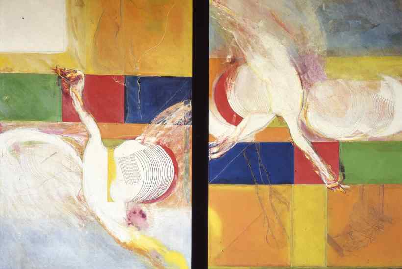
Even better is Frank Bowling’s ‘Big Bird’ (1965), in which two wounded and bleeding swans flutter against geometric areas of colour (borrowed from abstraction). These birds stand, Bowling explained, for ‘people who had broken lives’, adding, ‘If you don’t straighten up and fly right, you’re going to end up in the gutter.’ There’s a touch of Bacon here too, in the splattered gore and free-flying paint. Altogether more buoyant, indeed sumptuous and ebullient, is Gillian Ayres’s ‘Break-off’ (1961) in which a whole genus of new organisms like plankton or protozoa seem to float out of the canvas.
Biology was one of the obsessions of the age, as was science fiction. The ‘action sculptures’ of the short-lived Peter King suggest both: inchoate masses of material which seem just on the point of transformation into a body or a face. Something similar is true of Eduardo Paolozzi’s strange sentinel figures made by pressing bits and pieces of detritus into clay and suggesting robots, but also vagrants.
To my eye, though, the most effective three-dimensional works on show are not conventional sculptures but an array of pots by Lucie Rie and Hans Coper (both refugees from the Nazis). Coper especially was able to create forms and surfaces that look as if they might belong to an ancient culture and were simultaneously filled with the spirit of the times. His ‘hourglass’ vases are a bit like miniature versions of those monumental works of the 1960s, the cooling towers at power stations.
There is much more, too much to describe here, including remarkable documentary photographs by Roger Mayne and Nigel Henderson. Other artists and idioms and reputations remain in the not-to-be-resuscitated category. But, having said that, it’s true that our view of the past continues to alter as the present unfolds.
That’s happening as I write to works by Elisabeth Frink, William Turnbull and Lynn Chadwick in the idiom known as ‘geometry of fear’. These sculptural evocations of tangled metal, ruined cities and burned, blasted bodies used to seem like relics of a distant age. In the past few days, they’ve started to look horribly close to news reports.
Got something to add? Join the discussion and comment below.
Get 10 issues for just $10
Subscribe to The Spectator Australia today for the next 10 magazine issues, plus full online access, for just $10.
You might disagree with half of it, but you’ll enjoy reading all of it. Try your first month for free, then just $2 a week for the remainder of your first year.


Comments
Don't miss out
Join the conversation with other Spectator Australia readers. Subscribe to leave a comment.
SUBSCRIBEAlready a subscriber? Log in